box game devlog #1: Art styles
So here's a thing I'm doing now - more in-depth breakdowns of what exactly I'm doing with box game. Here's the first thing I'm gonna break down - the decisions being made with the art.
There's really two parts to this, and I'll break down game art here, and production/promotional art too, eventually. I don't think I have much to say about production art, since there's not much, but character designs might be fun to break down.
The number one thing I wanted with this art style was "charming clunk", the most immediate reference is that I found a questionably legal archive of NES ROMs and definitely did not download and play them, and something I kept coming back to was how detailed NES art could be, actually, and how a lot of the sensibilities of that art isn't really around anymore, because people know what art is, now, and how to get the most out of their pixel art.
|
|
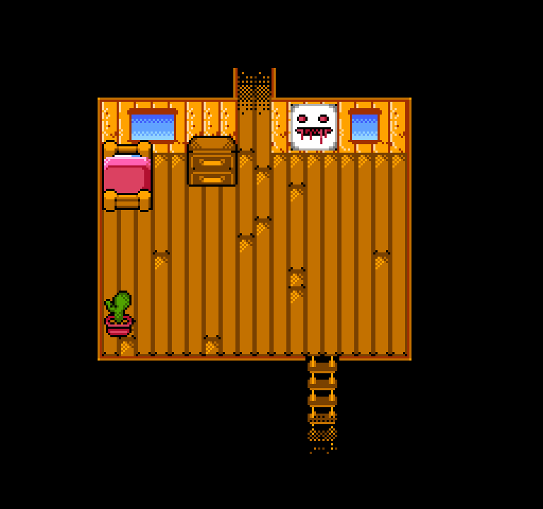
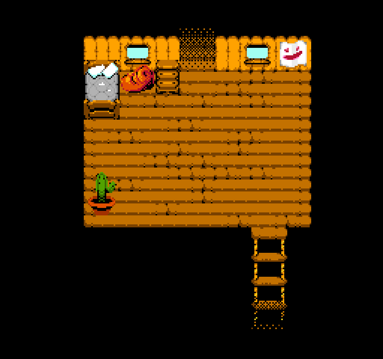
| Lemming's treehouse, old vs. new | |
Around this time, Intl Create's kickstarter goal game, Bloodstained: Curse of the Moon came out. It's a great game, but the thing I liked most was seeing the NES art - the animation was good, the tile sets were gorgeous. And I wanted that. The bold color choices. The texture of an NES game.
So this built box game up in my head as this sort of mush-like game, with mechanics that aren't well-explained, taking on a sort of interpretive tone to it. This was a good choice because I hate explaining things. I can show, I can not show, but I sure can't tell.
It was also a good choice because restrictions are essential for me when working on games, since without them, the game will get forever lost within its own scope, and never get finished. At the start, the first restriction I put on myself was that I was going to use the NES palette - the original art used the NTSC version, which is just a bit darker, a bit more drab than the PAL version.
This was good, at first, since the tone was more or less undecided, and it helped me realize this was not the tone I wanted the game to have, at least not at this point in the game.
At one point, the house that would become the wizard hut was a dilapidated shack. The roof would leak, the walls were covered in an ugly paint that was cheap, chipping away, the sink was filled with rust, it was just awful. I moved away from this as the Wizard's role in the narrative changed from "mercurial and sort of neglectful", to "Gen-X dad who doesn't quite connect with the kids".
Moving away from this palette was useful since it brought more color to the game, but it created a weird alternate choice - with the NTSC palette, the large amount of dark colors created less of a need for black outlines to get the most out of sprites, but with the PAL palette, the gap between the raw black and the darkest of each color spread was far greater.
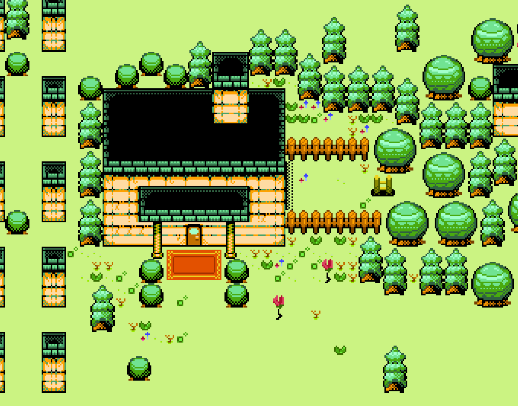
In my mind at the time, this necessitated a black outline around every object to make each thing clearly stick out. This was objectively fucking stupid and created some real bad ideas - when everything is emphasized, nothing stands out. I kind of chugged along like this until January this year (2019) when I watched AGDQ's Awful Block and two games stuck with me. First was Dragon's Lair: The Legend, a Game Boy Color game.
And second was Monkey King, an unofficial NES game.
Both of these games are the exact kind of clunky that box game needed - tiles designed for modularity, tiles you can safely fill blank areas with at random and it'll look exactly like I wanted it to. Tiles that aren't seamless. Tiles that are allowed to be as ugly as they need to be to convey tone.
That's the biggest part of the art pass I'm doing.
The rules for new art are as follows:
- No outlines.
- Respect the 4 colors per 8x8 tile limit.
- It's okay if you can tell it's tiles, and not bespoke drawings.
The last one is the most important to me - it's truth to materials. The goal is to make a video game, not convince people that the game they are playing is real.
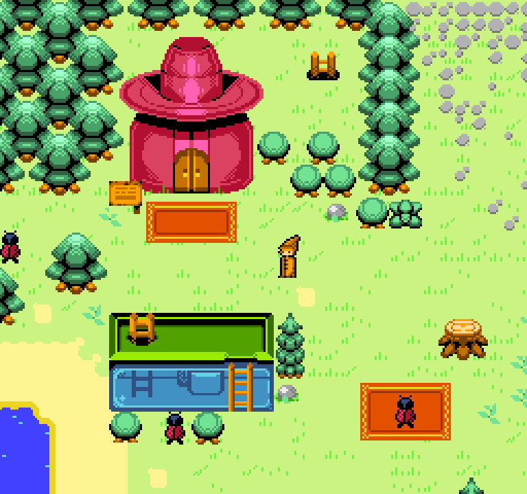
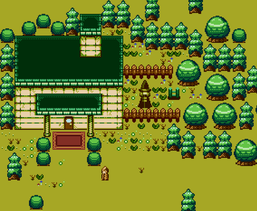
It's going okay - areas feel a lot more lush now that trees have defined shapes and aren't just big orbs, and the ability to use black in clusters rather than just as an outline has freed up a lot of possibilities. The end goal is that with this sort of antiquated style, the more modern ideas and capabilities will stick out just a bit more - little animation flourishes and effects come off a bit more obviously when the art style looks like it should be as static as possible.